The Golden Cross Pattern: Learn What It Is, Its Meaning, and How to Use It
Jan 29, 2025
Strategy
The Golden Cross Pattern: Learn What It Is, Its Meaning, and How to Use It
Introduction
In this fast-paced world, it’s increasingly hard to get ahead of market changes and trends. Many traders out there would do right to try to learn more about indicators that could help them make well-informed decisions.
Within that context, the golden cross is a famous chart pattern used in technical analysis, known for its strong indication that a bull market is about to emerge.
Traders can use this pattern to decide if and when they should open or close their positions in a specific asset, making sure that they start trading at the best time possible.
Keep reading to learn more about the famous Golden Cross and how you can start using this pattern in your short and long-term strategies.
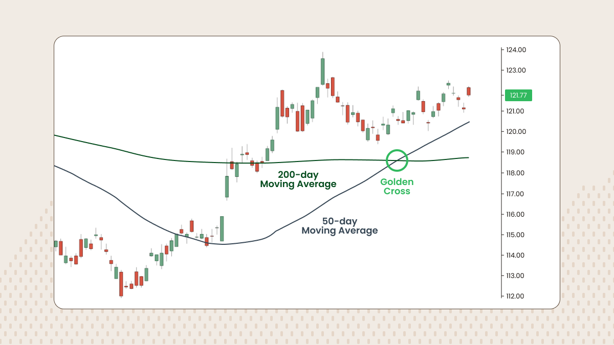
What is a golden cross?
A golden cross is a chart pattern that occurs when the short-term moving average of an asset crosses the long-term moving average from the bottom up.
The moving average is a line on a chart that depicts the average price of the asset over a period of time. It’s an interesting way to see the market behavior in a more straightforward way, without the noise of daily price variations.
Also, the short- and long-term periods can vary in the charts. The more common comparison is the 50-day moving average versus the 200-day moving average.
There are approximately 50 trading days in a quarter of a year, and 200 trading days in a year.
But this isn’t the only option by any means. Traders can set their desired timeframes to compare, like a 10-day moving average (MA) compared to a 50-day one, or a 100-day MA compared to a 200-day one.
Whether the timeframe taken is long or short depends on the trader’s focus. It’s also important to consider the volatility of the market, since smaller periods can be more helpful when trading volatile assets, like cryptocurrencies for example. However, it’s important to remember that charts with longer time periods usually are more reliable and carry extra weight to the analysis.
What are the stages of a golden cross?
Traders should look for these three stages while considering the appearance of a golden cross:
The end of a downtrend: This is the moment where sellers are losing momentum and buyers are getting more control.
The moment of the crossover: The short-term average gets faster than the long-term one and it starts growing until they cross.
The start of an uptrend: Prices continue to grow and the market is getting more bullish with each passing day.
What is the meaning of a golden cross?
The golden cross is a clear sign that the market is getting ready for a bullish turn. The bulls (buyers) are getting more action and everyone is more optimistic about the potential growth of the asset in question.
Historically, golden crosses have been a reliable sign of a bullish uptrend. One notorious example is the S&P 500 index that showed a golden cross after the downfall of the market caused by COVID-19 lockdowns. And indeed, after the golden cross appeared, the numbers started rising again.
High trading volume is an important indicator that a golden cross is right about the bullish trend.
Lastly, it’s important to note that since traders usually pay close attention to the appearance of a golden cross, this can become kind of a self-fulfilling prophecy. They start buying more after seeing the pattern and this helps the continuation of the bullish trend.
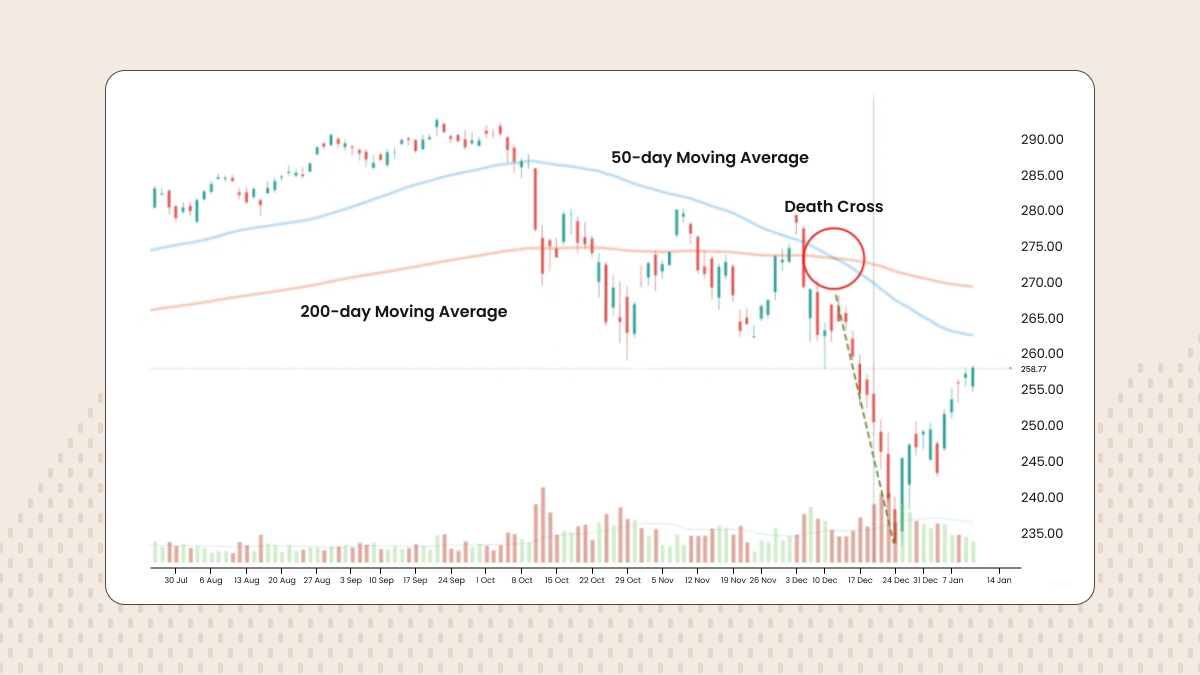
A death cross is the exact opposite of a golden cross. It happens when the short-term average of an asset crosses the long-term average in a downward direction.
In the same way, the more common periods used for comparison are the 50-day moving average versus the 200-day moving average.
Whereas the golden cross signals a bullish momentum, the death cross can mark the start of a bearish trend, signaling the falling of prices and strong selling dominance.
On the same note as the COVID-19 example mentioned above, a death cross also appeared just before the market decline caused by the epidemic’s panic.
Check out the table below for a side-by-side comparison of both famous patterns:
Golden cross
Death cross
The short-term average crosses the long-term average in an upward direction
The short-term average crosses the long-term average in a downward direction
Bullish indicator
Bearish indicator
Represents optimism inside the market
Represents pessimism inside the market
Indicates buying pressure and potential price growth
Indicates selling pressure and potential price decline
Happens after a downtrend
Happens after an uptrend
Hopefully, the table above helps you understand the opposite nature of these famous chart patterns.
Another important piece of information to consider is related to support and resistance levels during both crosses.
In simple terms, a support level is a low price below which the market historically hasn’t gotten. Alternatively, a resistance level is a high price above which the market historically hasn’t gotten.
Within those definitions, the long-term moving average becomes an important support level when a golden cross appears. Likewise, the long-term moving average becomes an important resistance level when a death cross appears.
In simple words, this just means the long-term average acts as a new kind of limit to the short-term one. Of course, this doesn’t mean prices won’t break free from those limits, they act more as an indication than a set-in-stone truth.
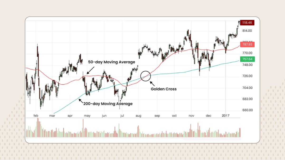
Real-world example of a golden cross
Historically, the golden cross has appeared on many different famous occasions during notorious market changes and reversals.
In addition to the COVID-19 example before, a golden cross can be seen in the chart below of Alphabet (Google) between August and September of 2016:
Image source: CFI
We can see in the chart that the prices indeed got higher after the golden cross, indicating a strong bullish momentum, before lowering again by December.
Many factors need to be considered while analyzing the appearance of a golden cross: the history of the asset and the specific market, how other significant markets are performing, and even macroeconomic news that can confirm or deny the reasons for the given momentum.
Nothing happens in a vacuum and, like many indicators in the investment world, the Golden Cross will work better for traders if they combine it with other market signals and knowledge.
How to use the golden cross in your trading strategy
If you see a golden cross and you believe it has good reason to be there, you can use this signal in many different ways in your strategies.
Decide your entry points: Since a golden cross is a strong sign of bullish momentum, you can initiate long positions at that time and start buying on the hope that the prices will indeed get higher.
Protect yourself with stop-loss placements: Even if you believe in the bullish potential, it can be smart to protect your funds in case things go dire. One strategy is to put a stop-loss order just below the long-term moving average, guaranteeing you’ll be prepared if the asset’s rising trend doesn't go much further.
Check out different timeframes: Although the 50-day and the 200-day are the more common ones, you can adjust for smaller or longer periods depending on your trading style. If you’re more of a day or swing trader, check smaller periods to spot short-term and mid-term trends.
Consider other market indicators: As mentioned, it’s not wise to use the golden cross, or any indicator, alone. Use it as an opportunity to check other market metrics, like the moving average convergence divergence (MACD) and the relative strength index (RSI).
In summary, while the golden cross in an important bullish signal, take care of your resources by using risk management tools like stop-losses and take-profits, and make sure to study the market as a whole rather than just trusting the cross on its own.
Here are some pros and cons that you should consider while using a golden cross appearance in your trading strategy.
Strengths
Self-fulfilling prophecy: Because the golden cross is commonly used in technical analyses by many traders, more eyes are seeing when it happens and therefore more investors can get excited to buy, helping confirm the bullish momentum that the cross marked.
Easy to see and understand: The concept of the golden cross is not the hardest to grasp and it’s also easy to spot its appearance in the moving averages charts. Because of that, traders of all kinds - beginners and more advanced ones - can use this bullish signal to make decisions.
It helps with the bigger picture: Since we are using long-term averages to study the price movements of an asset, traders who focus on long-term investments can benefit from that analysis without getting distracted by all that noise caused by daily price volatility.
Weaknesses
We are looking at the past: With a golden cross and many other financial indicators, we are looking at data that represent what has already occurred. This delay in the data can mean we are trying to get ahead of a trend that has already happened.
False positives can and do happen: Especially in more volatile markets, a golden cross can occur without the prices rising after it happens. It’s not a guarantee by any means and other information, especially real-world economics news, can be decisive in whether to trust a golden cross or not.
It can’t work in isolation: The golden cross signal shouldn’t be used alone to determine any trading decisions. Instead, traders should use it as a starting point, a reason to check other market indicators and even political occurrences that can throw light on the recent trend.
Summary
The golden cross is a widely known chart pattern that acts as a strong signal of a bullish market. Similarly, the death cross is the opposite version that signals a bearish trend about to happen.
Traders can use both patterns to prepare their strategies, including timing their entries and exits. Because the patterns use short and long-term averages, they are an important tool to track price movements over time, especially for investors that prefer a longer overview.
While they historically have been known for their reliability, it’s important to remember that both the golden cross and death cross shouldn't be used on their own. Instead, additional indicators and market information should complement their predictions.
Ready to start implementing these strategies today? Open your account and count on FBS for all your trading needs.